
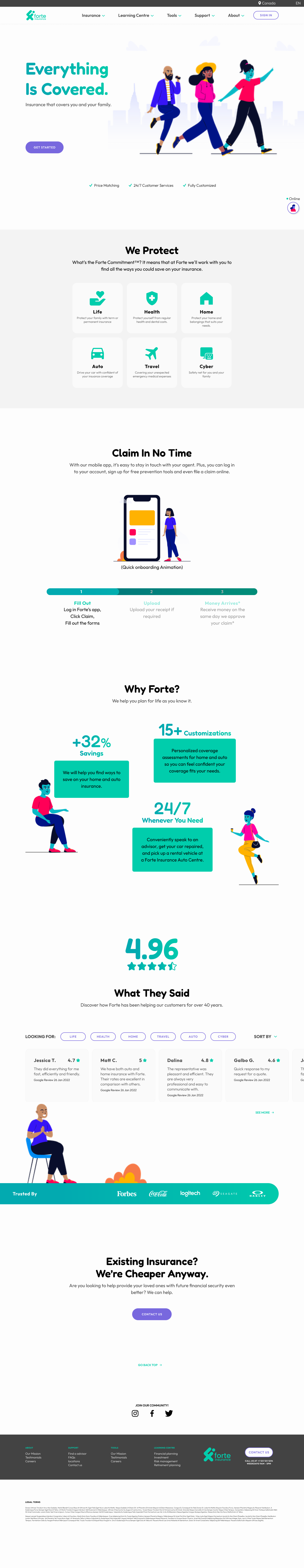
Forte Insurance (Forte) is a Canadian insurance company selling over 300 customized products and bundle packages. They have primarily focused on B2B for the past 30 years. This is a conceptual project. Credit to Vijay Verma for providing such beautiful illustrations.
Market share in Gen Z is shrinking because Forte has been relying on financial agents to sell its insurance products to individuals and businesses regionally.
How might we refresh Forte's brand to attract the younger generation and enable online insurance purchases?

The level of insurance knowledge varies among users. I conducted extensive user research to learn about our target users at age of 20 - 40.
3 key pain points
Difficulty in comparing different plans
Low price transparency
Cold branding
Relevant valuable findings
77% of participants prefer the customized product to the bundle
100% of participants will switch insurance providers because of lower cost
Prefer more graphic, less informative
Excellent customer service is important

Analyzed keen competitors in the market to get an insight into their SWOP.
16
10
3 days
Google Form
Over 60% of respondents are looking for stunning reviews of customer service when they are considering an insurance company. They also think an easy claiming process is part of customer service.
3
10 - 20 mins
Google Meet
77% of participants preferred the ability to tailor-make their own plan, and even better if they can bundle up different products.
9
Optimal Workshop
Hybrid + Open
Insurance products could be confusing to many sometimes. To learn about target users’ understanding, I conducted two sets of card sorting remotely.

Six insurance product groupings are identified in the hybrid card sorting by the similarity matrix. They are Auto Insurance, Home Insurance, Life Insurance, Health Insurance, Travel Insurance and Cyber Insurance.

Five categories are Identified for our information architecture in the open card sorting by similarity matrix and the standardization grid. They are About, Actions, Education, Product and Tools.

Nice-to-have recommendations
Keep all the communication online or by email
Request necessary information only
Add a real-time cost calculator in plan customization
Hybrid and open card sorting was conducted to learn about users' understanding of insurance products and define the information architecture which makes sense to the users.

Jacob, our persona, saw Forte’s sponsored feed on Instagram and decided to buy the auto insurance from Forte.

5
4
1 hour
Google Meet
Hi-fidelity desktop prototype
Top 3 frustrations
The unusual display order of insurance plans
Long navigation of the Quote page
All participants disliked the search bar in FAQs
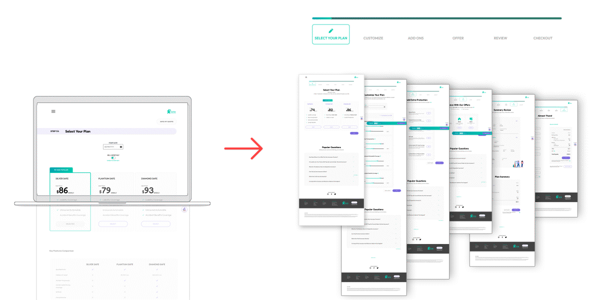
Design A and Design B were tested on the Quote page using two routes: Route 1 (A then B) and Route 2 (B then A), with participants randomly assigned to each route to avoid bias.

Wow, I love that Ronnie has actually called out my name.
Phoebe / 26, Single
This hovering effect looks very fun!!
Everyone!
I LOVE the checkout bar - I’m in full control of my plan and budget.
Kit / Mid 20, Single
Would be nice if I could see the search by product filter upfront ...
Many of them
Next, I made some iterations focusing on certain features that bring greater user value with the least effort. Due to the limited timeframe, a Feature Priority Matrix was used to determine the relationship.
Some examples of mobile versions. Homepage, Quote page, Customization page and Contact us page.


Some examples of desktop versions. Homepage, Product page, and Plan selection page.


All users had difficulty to keep tracking the price during plan customization.
Real-time price on checkout bar
The Quote page has a sticky checkout bar with real-time price updates based on user customizations. What you see is what you pay.
50% of users found the Quote page overwhelming due to its length and the need for excessive scrolling during the second usability test.
Lateral navigation
Separating the quoting process into multi-step pages for better lateral navigation. A progress indicator allows users to track progress and jump into any step at their best convenience. This helps users to digest.

66% of users mentioned that the website brand identity is crucial for them to trust an online insurance website because it is the first impression of a storefront.
Friendly agent Ronnie
Ronnie is a virtual assistant that helps users with insurance quotes. She guides users through the process, similar to an in-person experience. Users can easily find Ronnie as she is located as a FAB at the bottom right of the website.

The plan review summary is too general and lacks item details. Participants were not sure about the EDIT DETAIL since they didn’t know where this will take them.
User-friendly review
Show detailed descriptions for each item. A hyperlink EDIT is next to each item, allowing the user to jump back to different steps without going through the whole process.
With an energetic, youthful, and contemporary vibe, Forte now speaks perfectly to our users.
Playful design with approachable big titles and visuals, while using a more serious font for details to highlight Forte's commitment to user protection.

Don Norman isn’t lying. People generally like anything that responds to their actions, either micro-animation or audio.
During the usability test, participants even clicked a button that is not relevant, as long as the hovering animation looks fascinating to them.
All 5 participants hated the search bar on the FAQs page due to difficulties in coming up with keywords and uncertainty about where the search button takes them.
This is intriguing as the search bar has been incredibly efficient for me. But, I’m not the user.
Most preferred clickable options to narrow down the search for a sense of control.
I’d call it a big achievement if the user feels good filling in the form I designed. Everyone knows filling out information is the most annoying thing to do. It’s simply an art of balancing simplicity and necessity for the designers.
In the next step, I’d love to add the product comparison feature, so users can pick any plans to compare side by side and make decisions more effortless and quicker.


