
Most people feel dangerous when they encounter wild animals. Meanwhile, for wildlife enthusiasts, there is no way for them to exchange live tracks of animals. How might we create a worry-free outdoor adventure?


LOOK is an app that allows users to get live updates of wild animal sightings, get instant alerts and send emergency requests to rangers and the Looker’s community when encountering dangerous situations.
Users can register as either Looker or Ranger. While anyone can register as a Looker, only provincial park rangers can register as a Ranger.
For Looker
For Ranger
I focused on the looker’s journey in the end-to-end MLP due to time constraints.

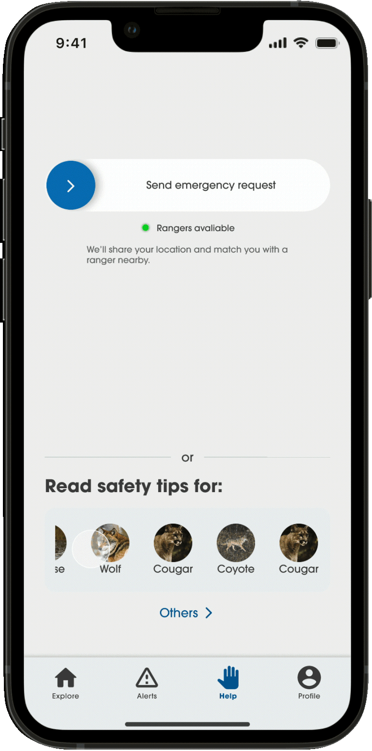
There was overwhelming information on the Help screen, all users struggled to understand.
Prominent Call-to-action
In emergencies, users may act impulsively. I reduced the number of decisions, created white space, and emphasized the CTA for direct help without panic.
What’s next? Users still freaked out after sending the assistance request because they didn’t know what is going to happen, and what was happening. They needed a clear response and ensured that someone was acknowledged and helping them.
Live location tracking
The user is updated with every status. A ranger will be matched within 2 minutes, otherwise, the request will be shared with all the lookers nearby to seek help. An interactive map tracks ranger and looker locations.

During the usability test, I tried to simulate the urgency of a real situation. All participants felt stressed about reading long sentences, even though they are on a bulleted list.
Mini animation aids
As in time-sensitive situations, prominent action words and animation aid quick skimming. The navigation bar was removed for simplicity to help users stay focused.
Plenty of similar products exist in the market. Combining competitive analysis and user research, I learnt about our users' pain points and how we solve problems differently.
13
12
4 days
Google Form
Apart from learning about users’ general behaviour in outdoor activities, I focused on how their behaviour would change if everything was happening on the go.

A word cloud was created based on the user's responses to “How do you feel about wild animals?".
2
25 mins
Google Meet
By identifying the patterns in the affinity maps, I was able to put users' pain points and desires into themes. The top issue would be the safety issues, and then the need for immediate help from others.
I'd love to see some animals as long as I'm safe.
Lung / Camper, hiker from Toronto
I don't know where to get information about the wildlife sightings in the park.
Carmen / City girl from New York
I can't tell what animals are thinking, what their mood is and what they're going to do.
Lung / Camper, hiker from Toronto
I rely on the park office to give me info …
Carmen / City girl from New York
I had done observative research when I went camping in Arrowhead Provincial Park, Huntsville, Ontario. The Big Bend Lookout is gorgeous btw! :)
A wildlife sightings board is right at the entrance of the park office. Only about 20% of people spent time on the sightings board, and only a few of them really read it.
Park users will put down their animal sightings, where and when. There is no standard format, some handwriting may not be legible. And it’s obviously not live-updated.

My camping folks - Grace, Ma and Gweyn are checking out the sightings.

Park users will put down their animal sightings, where and when. There is no standard format, some handwriting may not be legible. And it’s obviously not live-updated.
Based on the research, the existing products commonly lack offering assistance when the user is in danger. Instead of providing safety guidance which you can google easily, we focus on the power of the looker community and connect them with park rangers to get instant help.

I mapped out the priority of opportunity space where our product will thrive while tackling users’ problems.
3 personas were developed based on the user research.

With my personas in mind, I had created 5 key user flows for the MVP.
A user spots a bear and feels a bit anxious and looks for quick safety guidance from the app.

A user requests help after spotting an animal but he cannot identify the animal. He then loses access to the phone shortly after.

Examples of Alerts screen and Help screen.


3
4
25 - 60 mins
Google Meet
Low-fidelity prototype
Tasks
Onboard
Check out sightings in the area
Check out alerts
Get emergency help
3 key insights
Overwhelming information is given at once
Help screen’s layout is confusing
They did not get the help they expected

Some interactions of different tasks.
Participants sailed smoothly for all the tasks except for getting emergency help. I was shocked that the journey of asking for help was a disaster, it is the key feature of LOOK after all.
If there was some sort of threat indicator showing the potential level of danger, that would be nice.
Grace / Camping lover
I don't know how to read this, it is a bit overwhelming.
Bell C. / Occasional hiker
What does this mean? How do I tell the difference?
Carman / New Yorker with a dog
I was looking for something to help me right away, it is confusing that the app showed me this.
Grace / Camping lover
Then I made some iterations based on those insights along with the brand visual identity.
Calm
Safe
Reliable
Respect
Community
Human
These are the LOOK's DNA. Our vision is to protect each other leveraging the power of our community while we’re out in the woods.
People are familiar with park sign colours - blue for guide signs giving information and yellow for warnings. With this inspiration, I diluted the usual sign blue #0827F5 to make it less alarming to the users and deliver a sense of calm so that aligns with LOOK’s branding.


I discovered how people verify a brand heavily rely on its footprint on social platforms such as Instagram, Twitter, Tik Tok and Facebook. They thought this is the quickest way to fact check a company.
Don’t make me think - everyone knows what that means. That is even more true when we deal with high-pressure situations. Overwhelming information and too much decision-making would make everything worse, therefore we could almost expect the product to tell them what to do instead of asking questions.
This is an ongoing personal project, I really see the value this product can bring. When it gets warmer, I plan to do more user testing in real situations (e.g., hiking and camping). With all the research and data, I'll continue to develop the Ranger-facing app. I hope anyone in the wood can be benefited from LOOK one day:)
Happy sighting, Happy outing!


